deen

Bank Burgenland

category
office building
period of time
2019-2020
Status
completed
location
Eisenstadt, Austria
Client
Bank Burgenland
Photo Credits
Corinna Klug

How can design reflect corporate culture?


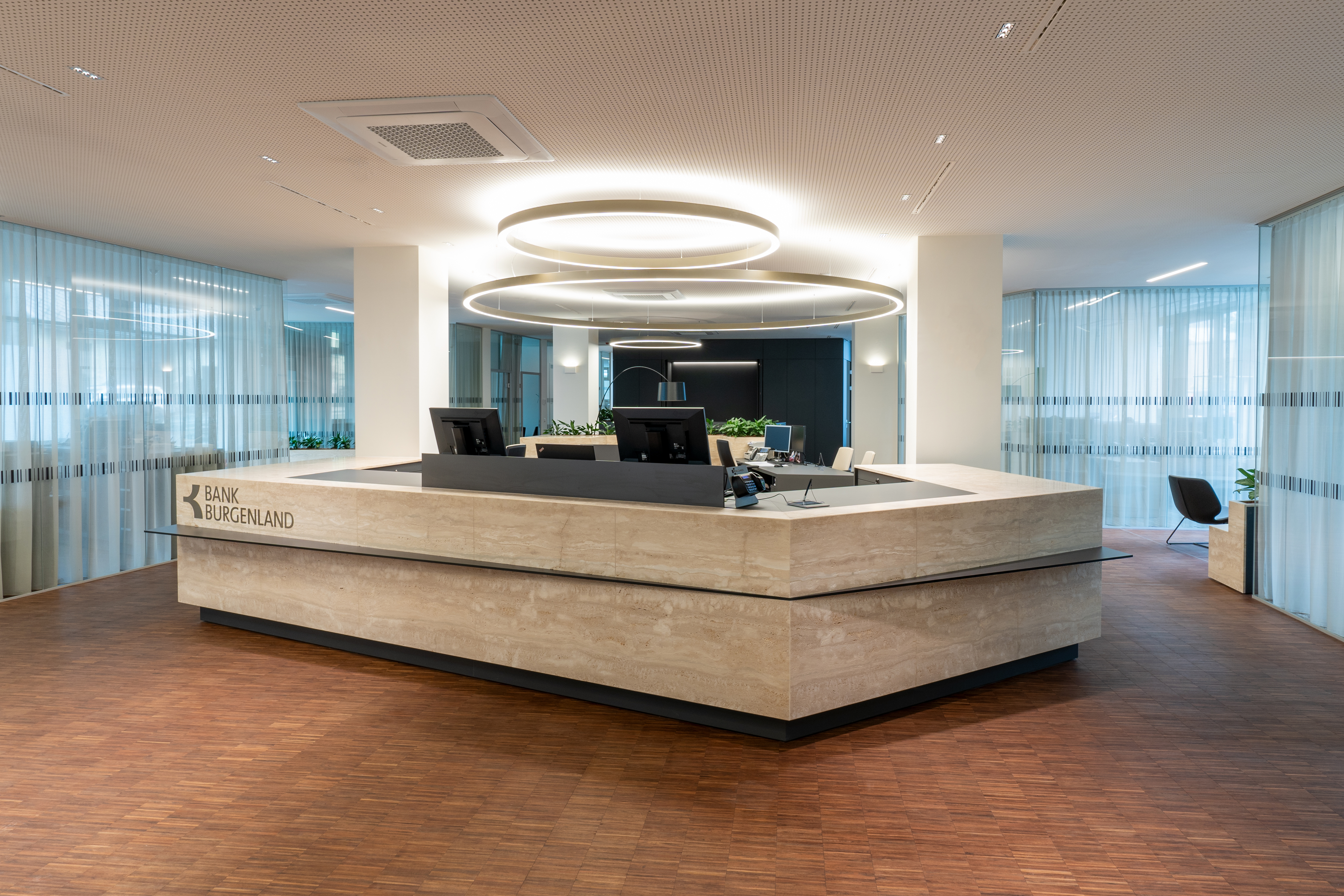
The assignment at Bank Burgenland was clear: No hierarchical division between management, personnel area and customer service area. The individual spaces are each given thematically different treatment but they are all equally important in terms of their formulation. Thus, it is possible to use the same high-quality materials throughout the entire interior but differentiate spaces in terms of style and color.
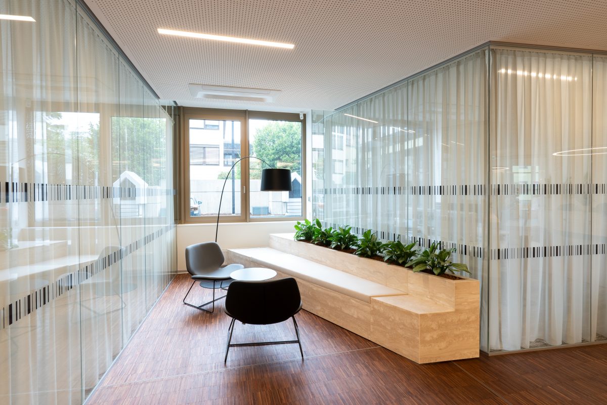
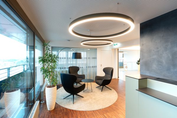
The customer service area on the ground floor was defined as having to convey security, stability and elegance. The chosen material, Italian travertine, was a deliberate choice here, because it embodies these properties so precisely.
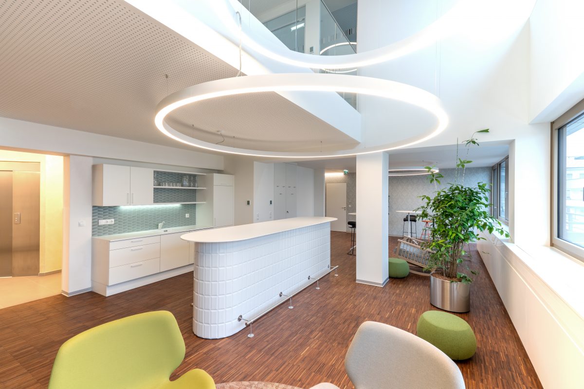
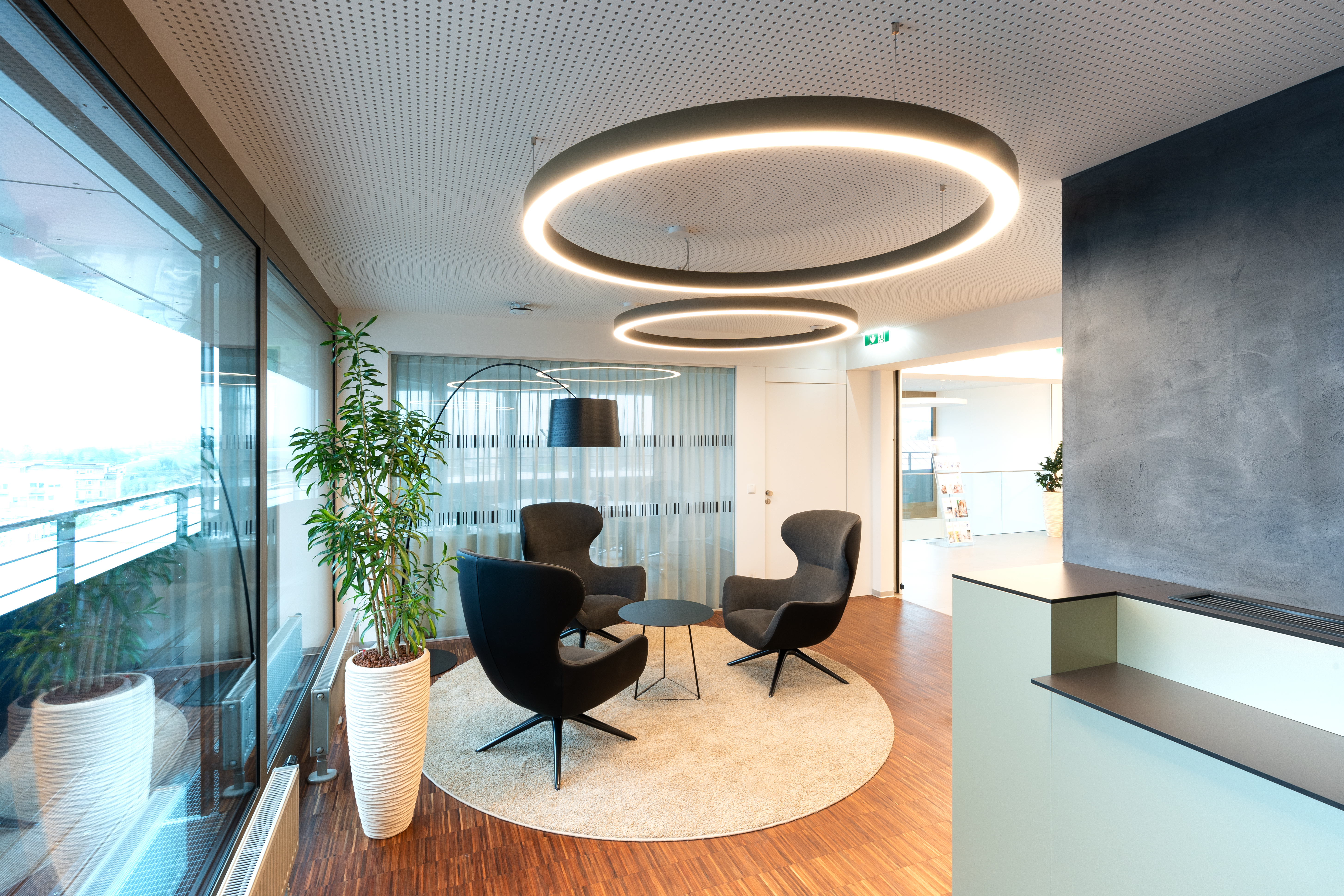
The personnel area on the upper floor, on the other hand, needed to radiate informality and coziness. The style chosen here was thus Shabby Chic. The primary materials used are walnut, wall tiles and carpets.

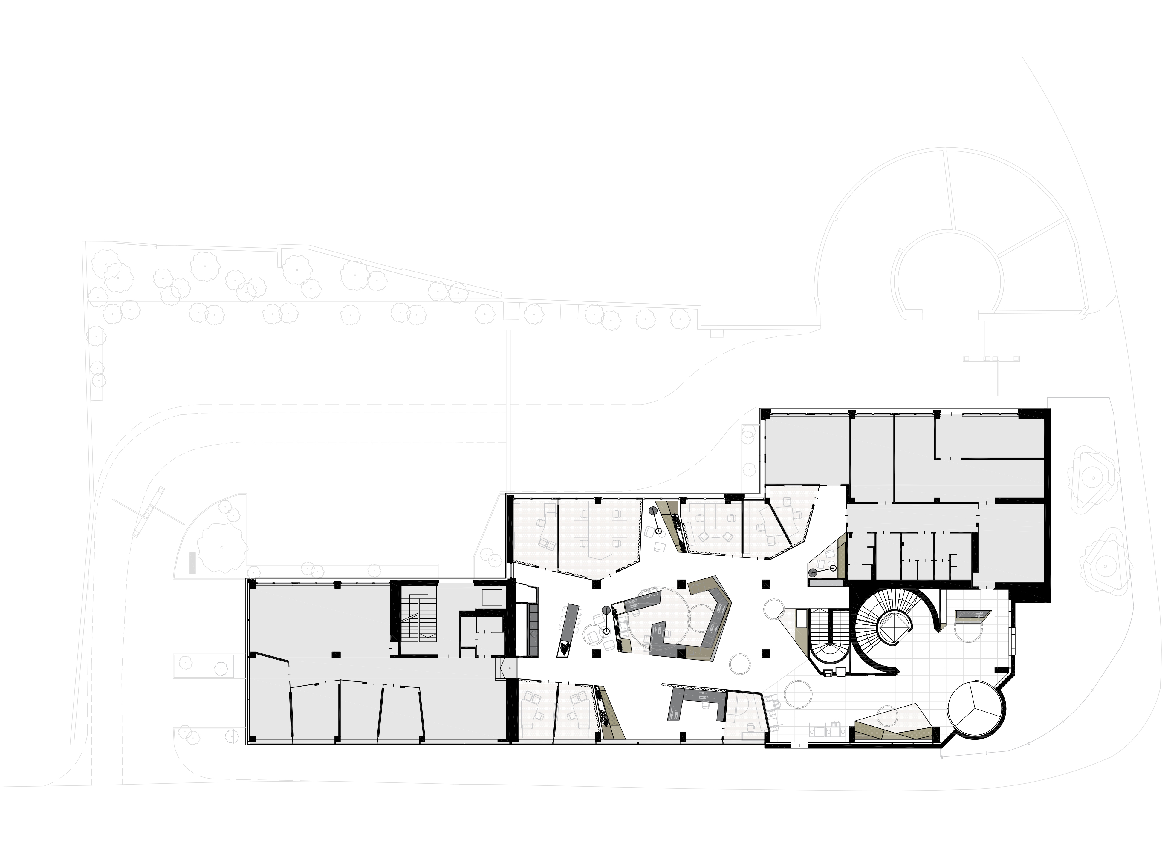
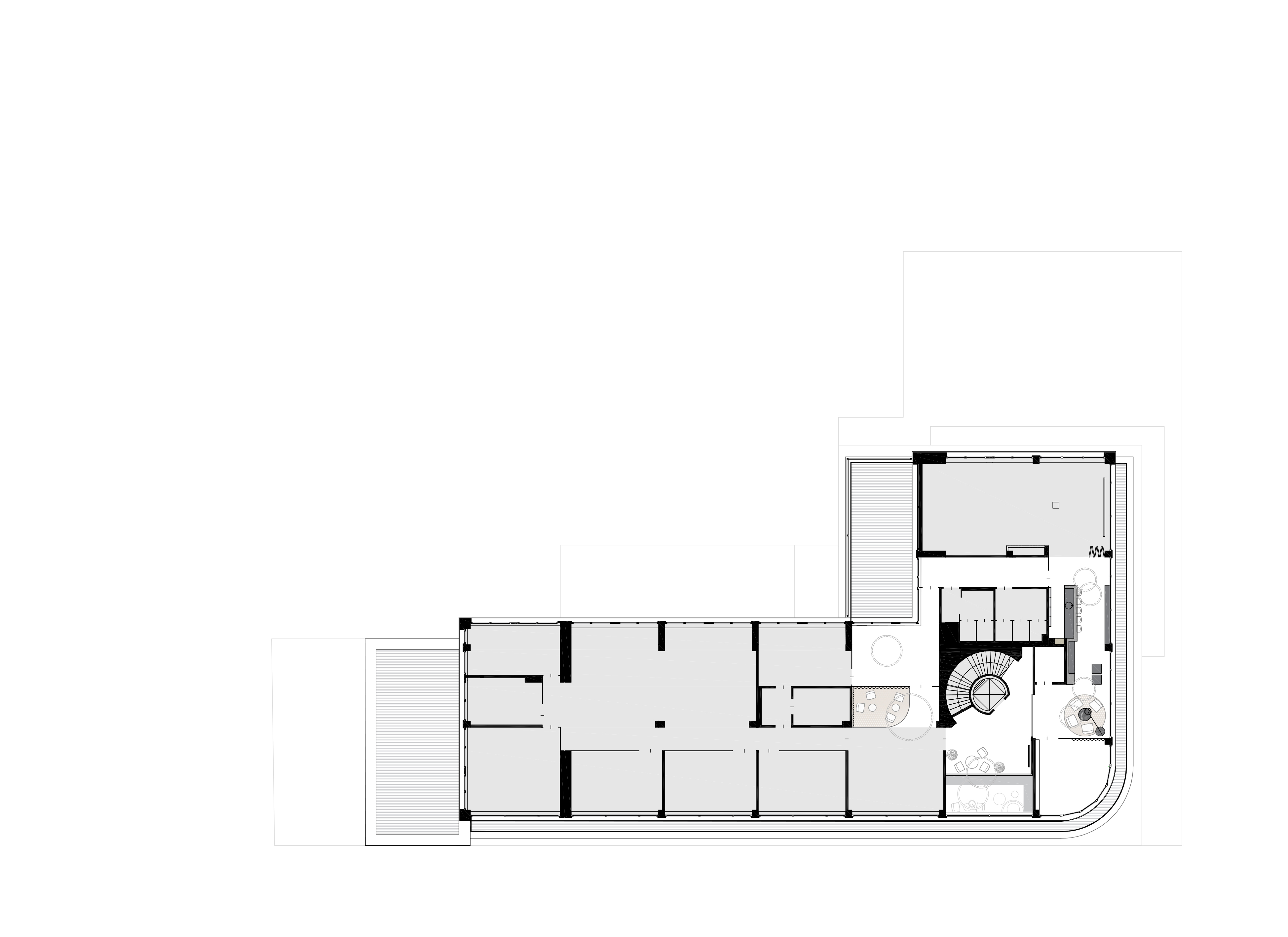
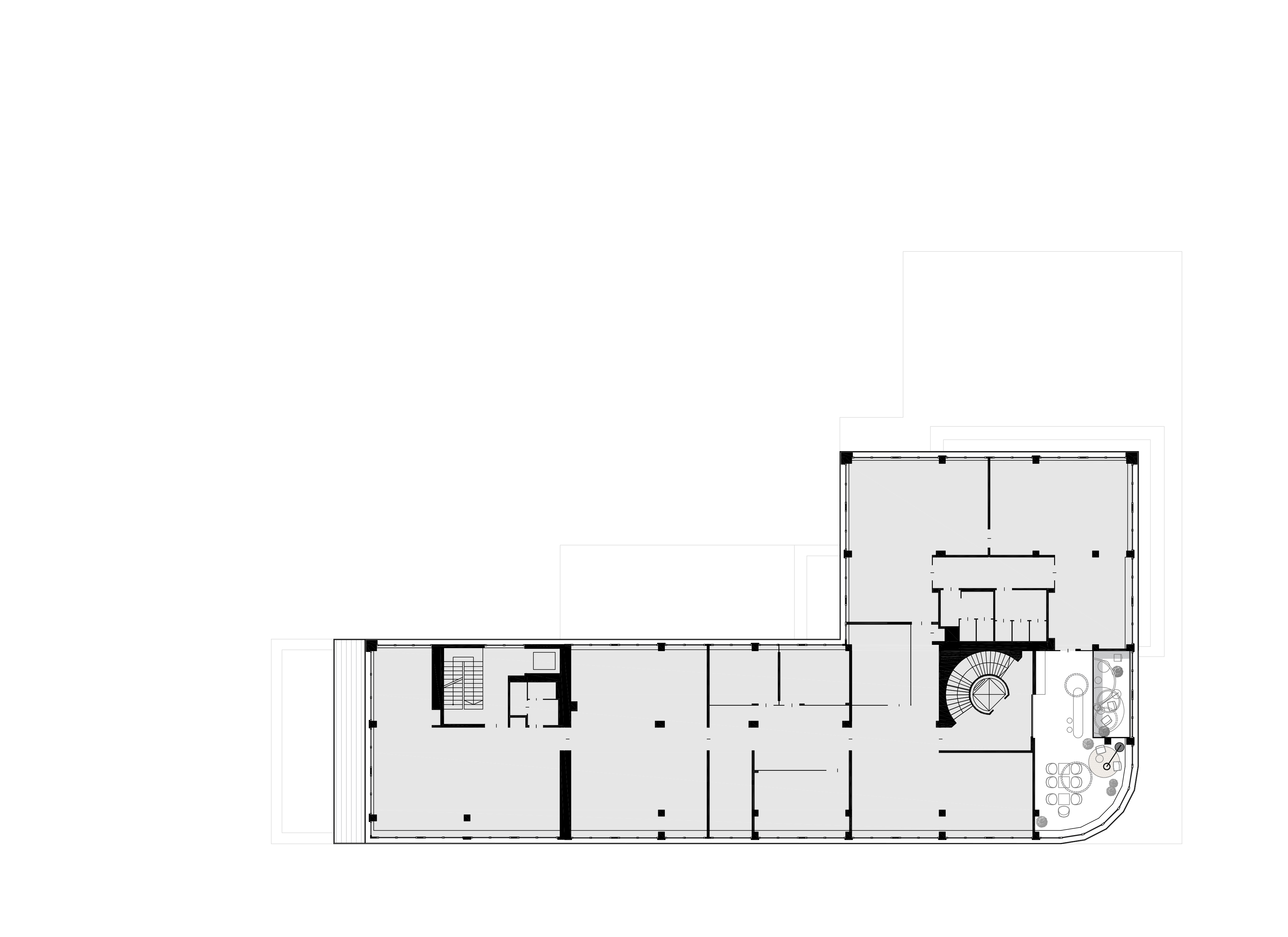
floor plan ground level 

Thinking ahead polygonally.


Especially when building to fit an existing building stock, it is often the case that you have to build on the ideas of other planners and develop them further. We took over this project in the concept phase. As a first step, we defined the quintessence of the design and came to a consensus with the client. All further planning was based on these findings.
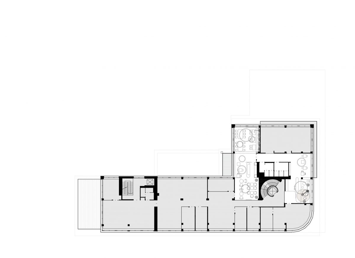
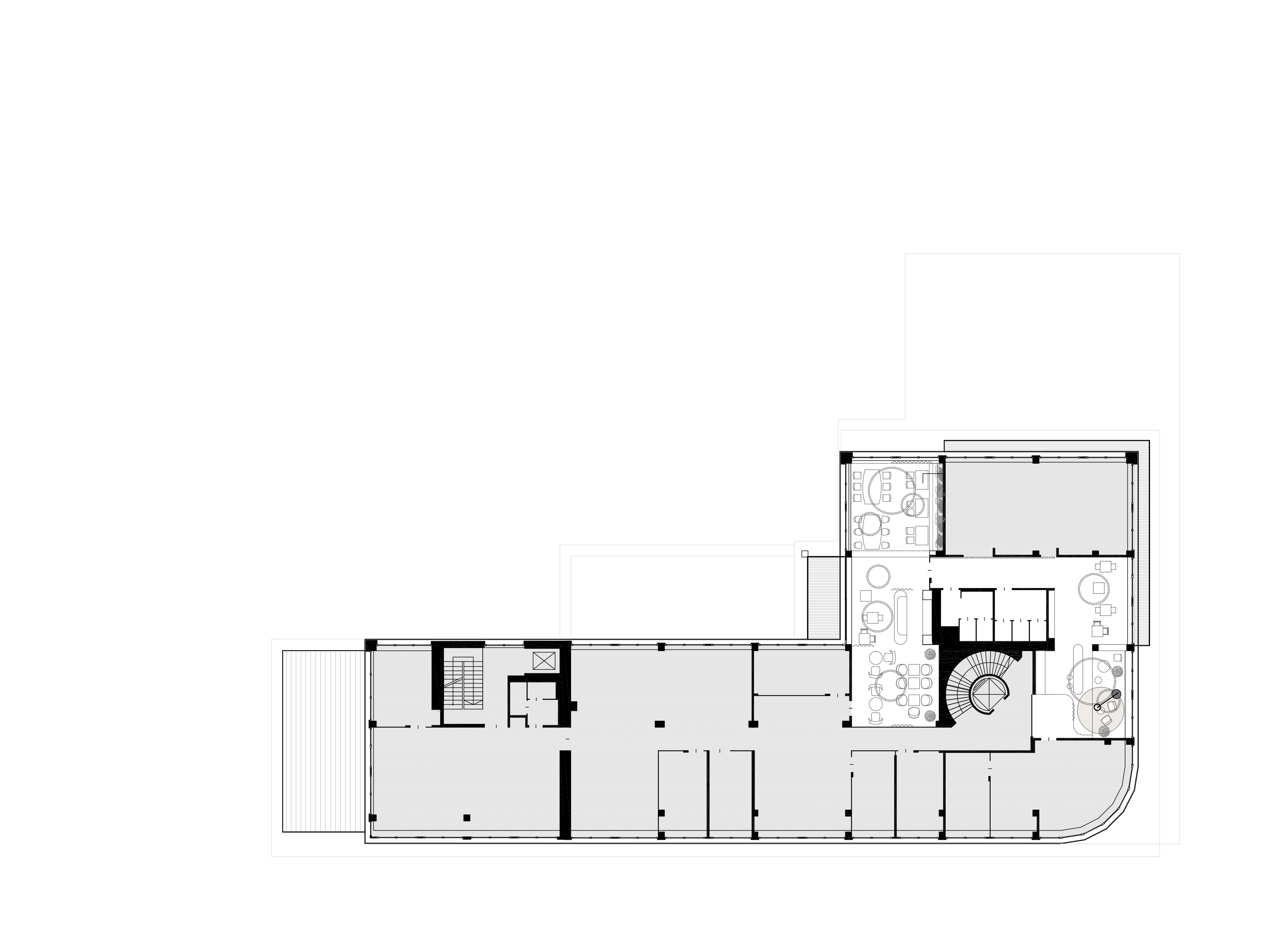
Thanks to the polygonal formulation of the design, the available space is used in the best way possible. Existing alignments are taken up and further developed. A targeted placement of lights, carpets and wall coverings creates different zones. The result is a welcoming open space that has a great deal to offer.

floor plan first floor

floor plan second floor

floor plan third floor

HANDY

category
office | interior
period of time
2019-2020
status
completed
location
Eisenstadt, Austria
client
Bank Burgenland
Photo Credits
Corinna Klug

How can design reflect corporate culture?


The assignment at Bank Burgenland was clear: No hierarchical division between management, personnel area and customer service area. The individual spaces are each given thematically different treatment but they are all equally important in terms of their formulation. Thus, it is possible to use the same high-quality materials throughout the entire interior but differentiate spaces in terms of style and color.
The customer service area on the ground floor was defined as having to convey security, stability and elegance. The chosen material, Italian travertine, was a deliberate choice here, because it embodies these properties so precisely.
The personnel area on the upper floor, on the other hand, needed to radiate informality and coziness. The style chosen here was thus Shabby Chic. The primary materials used are walnut, wall tiles and carpets.
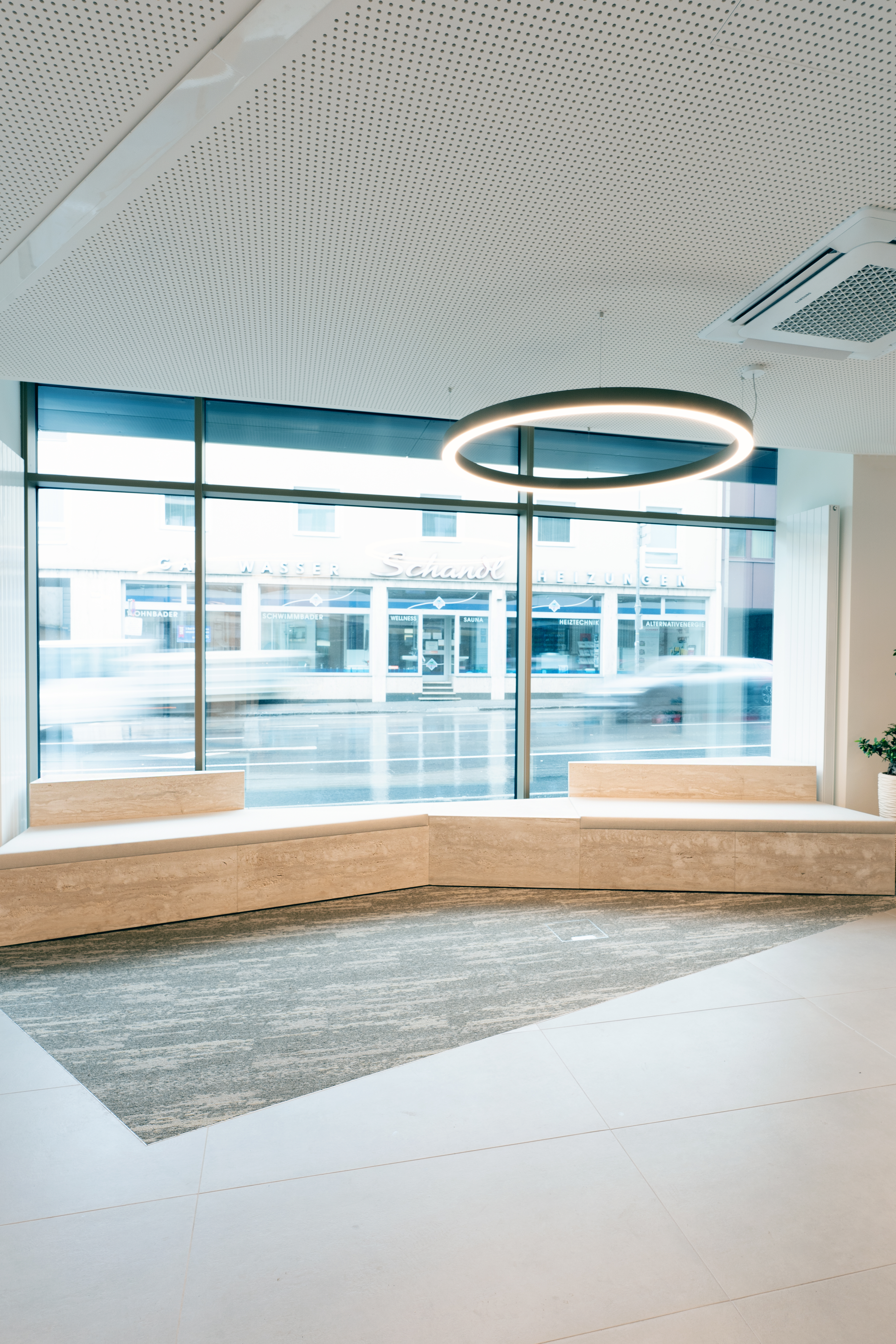
ground floor

Thinking ahead polygonally.


Especially when building to fit an existing building stock, it is often the case that you have to build on the ideas of other planners and develop them further. We took over this project in the concept phase. As a first step, we defined the quintessence of the design and came to a consensus with the client. All further planning was based on these findings.
Thanks to the polygonal formulation of the design, the available space is used in the best way possible. Existing alignments are taken up and further developed. A targeted placement of lights, carpets and wall coverings creates different zones. The result is a welcoming open space that has a great deal to offer.

first floor

second floor

third floor